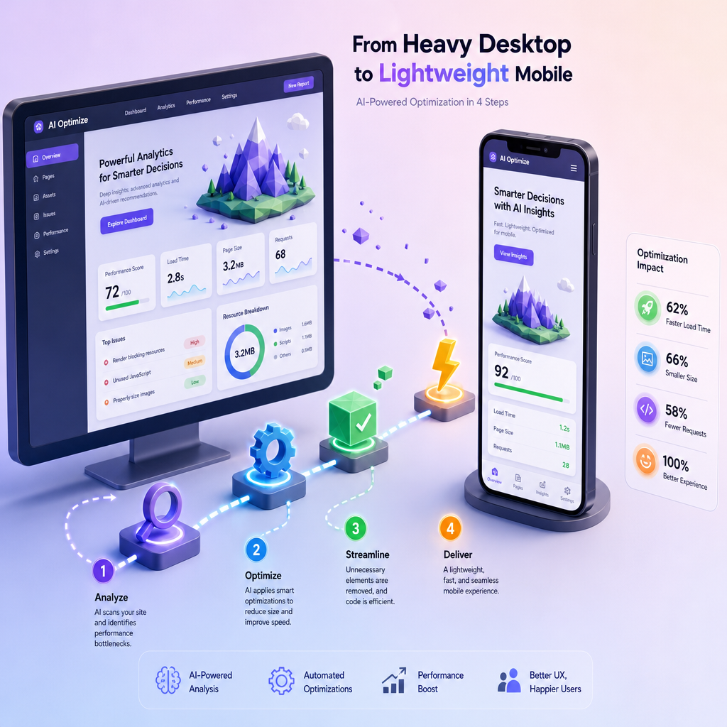
Step-by-Step Guide to Optimizing 3D AI Websites for Mobile Performance
Mobile users now account for over 58% of global website traffic. If your 3D AI website isn’t optimized for mobile, you risk losing both engagement and conversions. This guide breaks down exactly how to enhance your site’s performance on smartphones and tablets without compromising its 3D visuals or interactivity.
Why Mobile Optimization Matters for 3D AI Websites
3D AI websites are inherently resource-intensive, often requiring more bandwidth and processing power. On mobile, this can lead to slow load times and frustrating user experiences. By optimizing for mobile, you ensure:
!stepbystep guide to optimizing 3d ai websites for mobile performance, tutorials
- Faster loading speeds, reducing bounce rates (each second delay increases bounce rates by 32%)
- Better responsiveness for touch interfaces
- Improved accessibility for users on slower networks
Step 1: Optimize 3D Assets for Mobile Loading
3D visuals are often the heaviest elements on your site. Here’s how to reduce their impact:
- Use Lightweight Models: Compress 3D models using tools like Blender’s Decimate Modifier or glTF compression. Aim for under 500KB per model.
- Optimize Textures: Resize large textures to a maximum of 1024x1024 pixels and use efficient formats like WebP.
- Implement Lazy Loading: Only load 3D elements when they’re about to enter the viewport, reducing initial load times.
Step 2: Prioritize Responsive Design
Your 3D AI website must adapt seamlessly to various screen sizes and orientations. Use these techniques:
- Fluid Layouts: Use percentage-based widths for containers and elements instead of fixed pixel widths.
- Flexible 3D Viewports: Adjust camera angles and zoom levels dynamically based on screen size.
- Touch-Friendly Interactions: Design for tap, swipe, and pinch gestures, ensuring buttons are at least 48px by 48px.
Tools to Test Responsiveness
- Browser DevTools: Use Chrome’s “Device Mode” to preview your site on various devices.
- Responsinator: Test how your site appears on popular smartphones and tablets.
- Google’s Mobile-Friendly Test: Identify and fix any usability issues flagged by Google.
Step 3: Optimize Speed for Mobile Networks
Mobile users often rely on slower, less stable networks. Here’s how to ensure your 3D AI website loads quickly:
- Enable Gzip Compression: Compress website files to reduce their size by up to 70% before they are delivered to users.
- Use a Content Delivery Network (CDN): Distribute content geographically to serve assets faster. Cloudflare and AWS CloudFront are excellent options.
- Minify Code: Remove unnecessary characters from HTML, CSS, and JavaScript files. Tools like Terser can help.
- Preload Critical Resources: Prioritize loading key CSS, fonts, and scripts for above-the-fold content.
Step 4: Implement Mobile-Specific SEO Techniques
Google’s mobile-first indexing means search engines prioritize the mobile version of your site. To rank well, follow these tips:
- Optimize Meta Tags: Ensure your title tags and meta descriptions contain mobile-relevant keywords like “3D AI website mobile optimization.”
- Use Alt Tags for 3D Models: Describe the content of your 3D visuals in alt text for better SEO and accessibility.
- Create a Sitemap: Use Draftly’s built-in tools to generate a mobile-friendly sitemap and submit it to Google Search Console.
- Leverage Structured Data: Include rich snippets to enhance how your site appears in search results.
Step 5: Test and Refine Your Mobile Experience
After implementing these optimizations, test your website to ensure it performs well on mobile. Here’s how:
- Measure Page Speed: Use tools like Google PageSpeed Insights or GTmetrix. Aim for a load time under 3 seconds.
- Test on Real Devices: Emulators are great, but nothing beats testing on actual smartphones and tablets.
- Monitor User Feedback: Use heatmaps and session recordings via tools like Hotjar to understand how users interact with your site.
- Iterate Regularly: Optimization is an ongoing process. Regularly update and refine your site based on performance metrics and user behavior.
Common Mobile Performance Metrics
- First Contentful Paint (FCP): Time for first visible page content
- Time to Interactive (TTI): Time for the page to become fully interactive
- Cumulative Layout Shift (CLS): Measures visual stability during loading