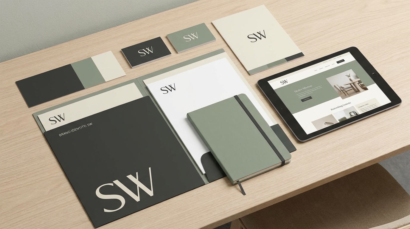
How to Customise Fonts, Colors and Your Brand Kit in Draftly
A website that looks like your brand is not an accident — it is the result of a consistent design system applied to every element. Draftly's Brand Kit centralises your fonts, colours, and brand voice in one place so that every site you build feels unmistakably yours.
What the Brand Kit Contains
The Brand Kit (accessible from the left sidebar under Brand DNA) stores:
- Primary and secondary brand colours — used automatically for buttons, headings, accents, and backgrounds
- Font pairings — heading font and body font applied across all sections
- Brand name and tagline — used to pre-fill headings when you generate new sections
- Logo — uploaded once, available in every header and footer
- Brand voice — a short description of your tone (e.g. "professional and warm" or "bold and direct") used by the AI when writing copy
Setting Your Brand Colours
Open Brand DNA → Colours. You can:
- Enter a hex code directly
- Use the colour picker
- Paste a URL and let Draftly extract your brand colours automatically from your existing website or logo
Tip: Choose colours with sufficient contrast. Draftly shows a contrast ratio warning if your text colour does not meet WCAG AA accessibility standards.
Choosing Your Fonts
Open Brand DNA → Typography. Draftly includes over 200 Google Fonts. For each font you can set:
- The font family
- Default weight (Regular, Medium, SemiBold, Bold)
- Letter spacing
- Line height
Applying Brand Kit Changes Globally
Any change to your Brand Kit is applied globally across all sections in your site instantly. You do not need to update sections one by one. This is the most time-saving feature for iterating on brand direction.
Saving Multiple Brand Profiles
If you manage websites for multiple clients, Draftly lets you create separate Brand DNA profiles. Switch between profiles when building different projects. Each profile saves independently.
For more on how Brand DNA works across multiple sites, read How to Use Brand DNA for Consistent Sites.
Typography Best Practices
- Limit yourself to two fonts. One for headings, one for body text. A third font is almost always unnecessary.
- Minimum body size of 16px on mobile. Smaller text causes users to zoom in, which breaks your layout.
- Use font weight for hierarchy, not size alone. A 600-weight subheading at 20px is more readable than a 400-weight heading at 28px.
Colour Best Practices
- Use your primary colour sparingly. If everything is your brand colour, nothing stands out. Reserve it for CTAs and the most important elements.
- Test in light and dark mode. If your site uses a dark background, make sure your colour palette has a light variant that works equally well.
- Avoid pure black (#000000) for body text. Use a very dark grey (e.g. #111827) for more comfortable reading.