Your pitch deck is the single most important document in your fundraising journey. Yet, most founders still rely on static PDFs—a format that offers zero engagement data, becomes instantly outdated, and gets lost in a sea of similar-looking attachments. To stand out in a competitive funding environment, you need a tool that works as hard as you do.
An investor pitch website transforms your static presentation into a dynamic, interactive, and trackable experience. It’s not just a deck; it's a statement. It shows you’re a forward-thinking founder who understands the power of brand and data. For startups with physical products or complex software, a 3D website can be the deciding factor, allowing investors to interact with your solution in a way that slides never can.
Why a Website Outperforms a PDF Deck
Moving your pitch from a file to a live URL provides immediate, measurable advantages that directly impact your ability to get callbacks and close rounds.
!investor pitch website build a deck that gets callbacks, tutorials
* Engagement Analytics: A PDF is a black box. You have no idea if an investor opened it, how long they spent on it, or which slides they focused on. A website, integrated with analytics, tells you everything. You can see which VCs are truly engaged, which sections of your pitch resonate most, and where you might be losing their attention. This data is invaluable for follow-ups and refining your pitch.
* Real-Time Updates: Found a typo after sending a crucial email? Landed a new key customer? With a PDF, you’re stuck. With a website, you can update metrics, team members, or your product roadmap in seconds. Every investor with the link will always see the most current, accurate version of your pitch.
* Interactive Storytelling: Investors see hundreds of decks. A website allows you to break the monotony. Instead of a static chart, you can use animated graphs that build as the user scrolls. Instead of a product screenshot, you can embed an interactive 3D model. This level of engagement makes your story memorable and demonstrates the quality of your execution. This is a core reason why 3D websites are the next frontier for brand differentiation.
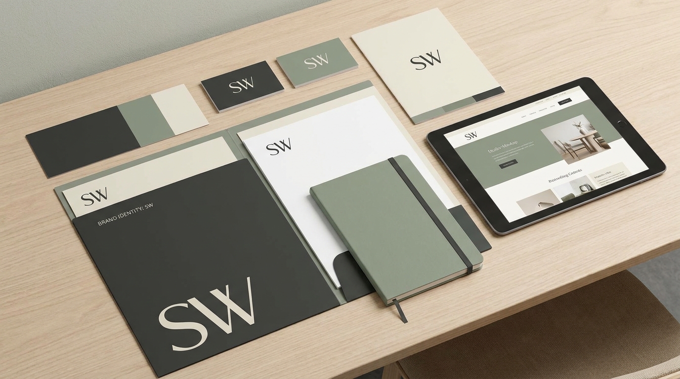
* Complete Brand Control: Your website is an extension of your brand. You control the entire experience, from the domain name to the favicon. It establishes a professional and cohesive brand identity from the very first touchpoint, unlike a generic PowerPoint template.
The Anatomy of a High-Impact Pitch Website
Structure your website like a compelling narrative. Each section should flow logically to the next, building a case for your company and leading the investor to a clear call to action.
1. The Hook (Hero Section)
Your hero section must grab attention in under five seconds. It needs a single, powerful sentence that clearly and concisely explains what you do. This isn't the place for jargon. Think: "We help e-commerce brands reduce returns by 40% with interactive 3D product pages."Accompany this one-liner with a stunning visual. A high-quality 3D render of your product, a short video loop of your software in action, or a powerful image that represents the problem you solve.
2. The Problem
Clearly articulate the pain point you are solving. Who is experiencing this problem, and why is it significant? Use data to quantify the problem's scale. For example, "On average, 30% of all products ordered online are returned, costing businesses over $1 trillion annually."Visualize this data to make it more impactful. Using subtle page transitions and section animations to reveal key statistics can draw the investor's eye and make the information more digestible.
3. The Solution
This is where you introduce your product or service as the clear answer to the problem you just outlined. The goal is to show, not just tell. If you have a physical product, embed an interactive 3D model that investors can spin, zoom, and explore. If you have software, use an animated GIF or a short, embedded video (like a Loom) to walk through the core user flow.4. Market Size (TAM, SAM, SOM)
Investors need to see a big opportunity. Present your Total Addressable Market (TAM), Serviceable Addressable Market (SAM), and Serviceable Obtainable Market (SOM). Use clean, simple charts to display these figures. Avoid clutter. Cite your sources for these numbers to build credibility.5. Product & Technology
Provide a deeper dive into how your product works. What is the underlying technology? Do you have any proprietary IP or a unique process that gives you a competitive advantage? Use a mix of concise text and clear diagrams. You can even use AI image generation to create compelling visuals that explain complex technical concepts simply.6. Business Model
How do you make money? Be direct. Is it a monthly SaaS subscription? A per-transaction fee? A one-time hardware sale? A pricing table or a simple infographic can explain your revenue streams much more effectively than a dense paragraph.7. Traction & Milestones
This is your proof. Data is your best friend here. Showcase key metrics like Monthly Recurring Revenue (MRR), user growth charts, customer acquisition cost (CAC), and lifetime value (LTV). If you're pre-revenue, focus on user engagement, pilot programs, or letters of intent. A visual timeline of your past achievements and future roadmap is highly effective.8. The Team
Investors bet on teams as much as ideas. This section should feature professional headshots and brief bios for the key founders and team members. Highlight domain expertise and relevant past successes. Why is your team uniquely qualified to solve this problem and build a massive company?9. The Ask & Use of Funds
Be specific and confident. State clearly how much you are raising (e.g., "We are raising a $1.5M seed round."). More importantly, show investors exactly where their money will go. A pie chart is perfect for this, breaking down the allocation: 40% for product development, 30% for sales and marketing, 20% for new hires, and 10% for operational expenses. This demonstrates that you are a thoughtful planner.10. Contact & Next Steps
Make it incredibly easy for an interested investor to take the next step. The goal is to get a meeting. Include a clear call-to-action button that links to your Calendly or another scheduling tool. You should also add a contact form for those who prefer to send a direct message.Design and User Experience Matter
A great story can be ruined by poor delivery. Your pitch website's design is critical.
* Clarity Over Clutter: Use ample whitespace. Each section should have a single focus. Don't try to cram too much information into one view.
* Brand Consistency: Your pitch website is a product. Ensure it aligns with your brand's identity. You can easily customise fonts, colors, and your brand kit in Draftly to maintain a professional and cohesive look.
* Mobile-First: Investors are busy. They will view your pitch on their phones between meetings. Your website must be flawlessly responsive and load quickly on mobile devices.
Your pitch is more than just data; it's a vision for the future. By building it as an interactive website, you give that vision the compelling, professional, and data-backed platform it deserves.
---
Ready to build an investor pitch that closes? Draftly’s AI-powered 3D website builder gives you all the tools to create a stunning, interactive deck in minutes. Start building for free.