Minimalism had a good run. For years, web design was dominated by soft shadows, subtle gradients, and sans-serif fonts so friendly they felt apologetic. But a rebellion is brewing against this sea of sameness. Enter Neobrutalism in web design, the raw, high-contrast, and unapologetically bold trend that tech startups and creative agencies are embracing to command attention. Search interest in the style has surged by over 300% since 2021, signaling a major shift in digital aesthetics.
This isn't just about being different for the sake of it. Neobrutalism is a strategic choice for brands that want to project confidence, honesty, and a no-nonsense attitude. It’s a visual pattern interrupt that stops the endless scroll and makes a lasting impression.
What is Neobrutalism in Web Design?
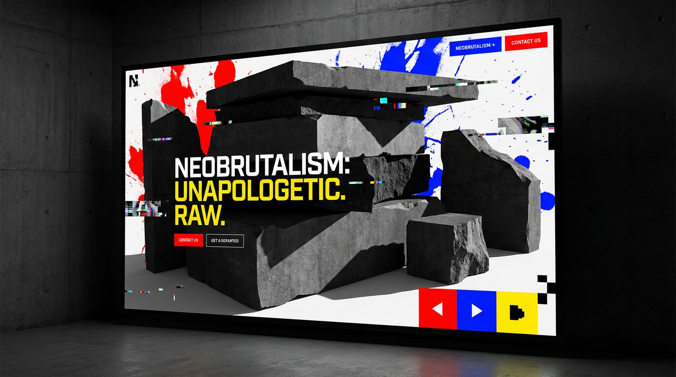
Neobrutalism is the modern evolution of classic web brutalism. While original brutalism was characterized by raw, unstyled HTML—a direct nod to brutalist architecture's focus on bare materials—neobrutalism is far more intentional. It adopts the raw aesthetic but pairs it with the principles of modern UI/UX design, including accessibility and usability.
!neobrutalism in web design the bold trend agencies are using, product
It's a style built on a few core, unmissable characteristics:
Key Characteristics of Neobrutalism
* High-Contrast Colors: Forget muted palettes. Neobrutalism thrives on stark, often default, colors. Black text (#000000) on a plain white (#FFFFFF) background is common, punctuated by a single, vibrant accent color like electric yellow, primary blue, or neon green.
* Chunky, Utilitarian Typography: Fonts are a centerpiece of the style. Expect heavy, often monospaced or blocky sans-serif typefaces that prioritize readability and impact over elegance. There's no delicate lettering here.
* Raw, Unstyled Components: Buttons and containers often appear as simple, bordered rectangles without gradients, rounded corners, or other decorative effects. They look like the basic building blocks of the web, presented with total transparency.
* Sharp, Solid Shadows: The soft, blurred `box-shadow` is replaced by a hard-edged, solid black shadow, typically offset by a few pixels in each direction. It creates a distinct, almost sticker-like effect that makes elements pop.
* Grid-Breaking, Asymmetrical Layouts: While the underlying structure is often a standard grid, neobrutalist designs deliberately place elements in ways that feel slightly off-kilter, adding visual tension and drawing the user's eye to specific areas.
Why This “Ugly” Trend Is So Effective
The initial reaction to neobrutalism can be jarring, but its rapid adoption by major brands like Figma and Gumroad isn't accidental. The style solves several key challenges modern brands face.
It Commands Attention
Users form a first impression of a website in just 50 milliseconds. In a digital world saturated with clean, predictable layouts, neobrutalism’s high-contrast visuals and raw typography act as a powerful hook. It’s impossible to ignore, forcing users to stop and process what they're seeing. This visual disruption is a massive advantage when you only have seconds to make an impact.It Projects Honesty and Authenticity
With over 70% of Gen Z consumers preferring brands they see as authentic, neobrutalism’s unpolished aesthetic resonates deeply. It feels honest and transparent, as if the brand is showing you its functional core without any decorative fluff. This builds a unique form of trust by rejecting the overly polished, salesy feel of many corporate websites. This is one of the core reasons it's a leader among the web design trends dominating 2025.It's a Masterclass in Brand Differentiation
When every competitor's website uses the same friendly illustrations and gentle color palettes, being bold is the ultimate competitive advantage. Neobrutalism is memorable. It gives a brand a distinct personality—confident, direct, and a little bit rebellious. It's a powerful tool for brand differentiation that sticks in a user's mind long after they've closed the tab.How to Use Neobrutalism Without Alienating Users
Adopting neobrutalism isn't an all-or-nothing decision. You can incorporate its principles strategically to add personality and impact to your site without sacrificing usability. The key is balance.
- Start with Typography and Color. The fastest way to introduce a neobrutalist feel is through your brand's typography and color scheme. Switch to a blocky, confident font for headings and adopt a high-contrast color palette. You can learn how to customise fonts, colors, and your brand kit in Draftly to easily experiment with these foundational elements.
- Apply Hard Shadows to Interactive Elements. Use the signature hard-offset shadow on key call-to-action buttons, cards, or input fields. This not only adds a distinct neobrutalist flair but also clearly signals to the user which elements are interactive, improving usability.
- Ensure WCAG Accessibility. While the style champions high contrast, it's critical to test your specific color combinations. Black on white is a safe bet, but vibrant accent colors on dark backgrounds can sometimes fail accessibility standards. Use a contrast checker to ensure your text is readable for all users.
- Combine Rawness with Modern Polish. Neobrutalism doesn't have to be static. The most effective implementations pair raw components with smooth, modern interactions. For instance, you can apply slick page transitions and section animations to a neobrutalist layout to create a dynamic experience that feels both raw and refined.
Ready to build a website that breaks the mold? Generate your cinematic 3D site with Draftly in seconds.