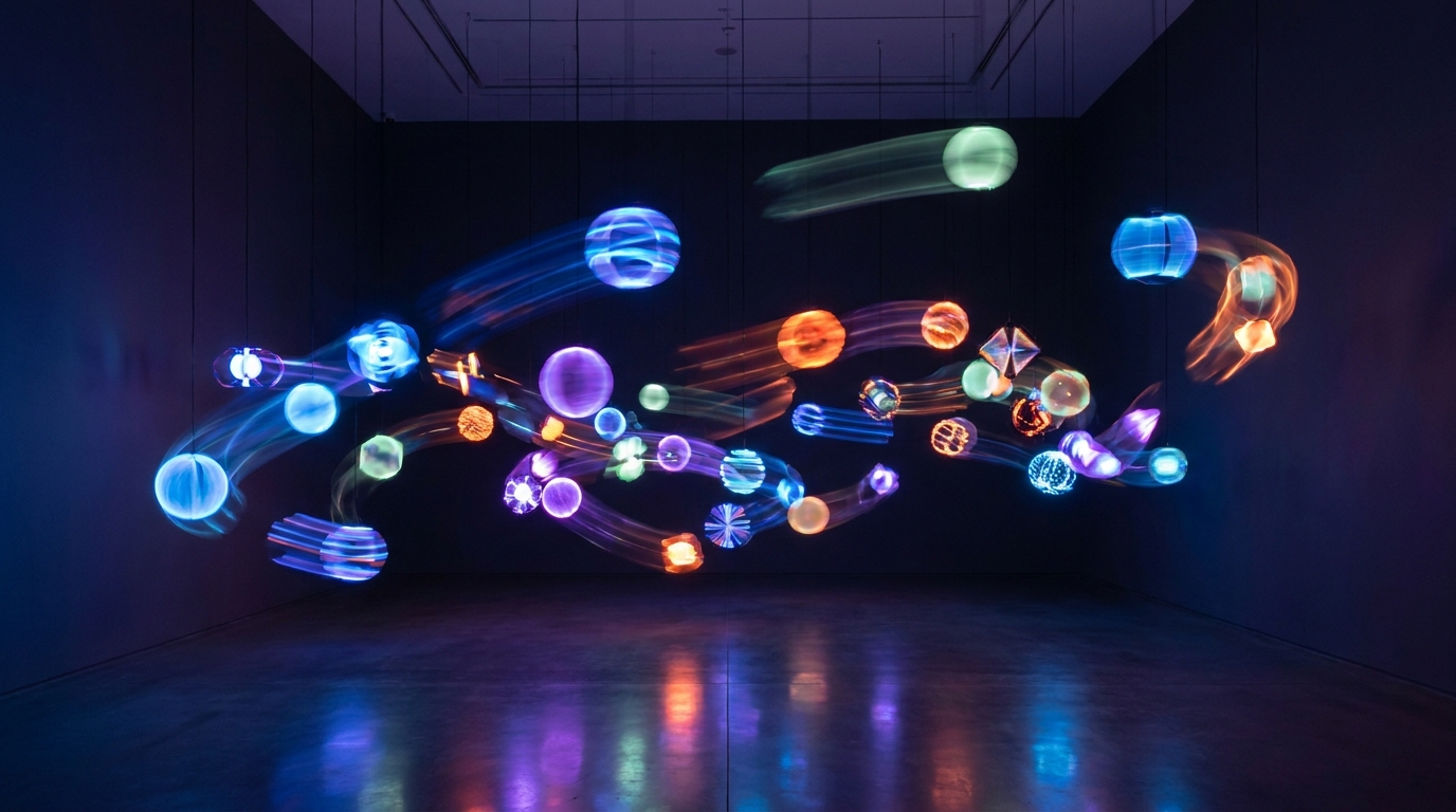
Flat design had its moment, but the web is rediscovering depth, emotion, and dimensionality. The proof? A massive resurgence in gradients in web design, with an estimated 70% of top-tier agency websites now incorporating some form of color blending. Forget the harsh, amateurish gradients of the early 2000s. The 2025 gradient is sophisticated, purposeful, and technologically advanced, serving as a powerful tool for visual storytelling.
This isn't just about splashing two colors on a background. It's about creating mood, guiding the user's eye, and building a memorable brand identity that a single flat color simply can't achieve. From barely-there ambient glows to vibrant, unmissable aurora effects, gradients are the new frontier of digital texture.
Why Gradients Are Dominating Web Design in 2025
The shift away from stark minimalism isn't accidental. Users and brands alike are craving more organic, engaging, and human-centric digital experiences. Gradients are a direct answer to that demand, offering a blend of artistry and strategic design.
!gradients in web design 2025 from subtle to bold, product
Creating Depth and Dimension
After years of flat interfaces, gradients reintroduce a sense of depth and realism. A subtle light-to-dark fade can make a button feel tactile and clickable, while a soft radial gradient can make a background recede, pushing key content forward. This illusion of space is crucial for modern interfaces, especially when combined with 3D effects without overwhelming the user.* The Data: A/B tests show that call-to-action buttons with subtle gradients can see up to a 5% higher click-through rate compared to their flat counterparts because they appear more interactive.
Evoking Emotion Through Color
Color is psychology, and a gradient is a conversation between colors. The transition from a calm, trustworthy blue to an innovative purple can tell a story about a fintech brand's evolution. A blend of warm oranges and pinks can create a feeling of energy and optimism for a wellness app. This emotional resonance is something a single hex code struggles to match. When done right, it's a core part of choosing a color palette that connects with your audience.Enhancing Brand Uniqueness
A unique gradient is a powerful brand asset. While thousands of companies might use 'blue,' Spotify's iconic green-to-black or Instagram's sunset-hued gradient are instantly recognizable. In a crowded market, a custom gradient helps brands carve out a distinct visual identity that is difficult to replicate, moving beyond the generic templates that defined the last decade.The Gradient Spectrum: Key Trends for 2025
Today's gradients aren't a one-size-fits-all solution. The trend is defined by its versatility, spanning a full spectrum from understated elegance to high-energy impact. Here’s what you’ll see everywhere.1. Subtle & Ambient Gradients
This is the most sophisticated trend. Instead of a clear color-to-color transition, ambient gradients mimic natural light. Think of a faint glow in the corner of a container or a background that shifts almost imperceptibly from a light grey to a slightly warmer tone.* Where to use it: Backgrounds of clean, professional websites; pricing cards; hover states on buttons.
* The Goal: To add a premium, polished feel without distracting from the main content. It makes the design feel less sterile and more alive.
* Example: Stripe’s homepage often uses incredibly soft, large-scale gradients to create an ethereal, high-tech atmosphere.
2. Mesh & Aurora Gradients
Mesh gradients are the breakout stars of 2025. These are multi-color, free-form gradients with soft, blurry edges, often animated to shift and morph slowly. They are generated by defining multiple color points on a grid, creating an organic, liquid-like effect that feels both futuristic and natural.* Where to use it: The perfect choice for a modern website hero section design, app login screens, and feature backdrops.
* The Goal: To create a dynamic, visually rich experience that captures attention and conveys innovation. The slow animation is key—it provides visual interest without being jarring.
* Example: The tech tool Linear uses these masterfully on its website, creating a sense of fluid power and motion.
3. Bold & Punchy Gradients
At the other end of the spectrum are the high-energy, vibrant gradients. These use saturated, often contrasting colors to make a strong statement. Think neon pinks fading into electric blues or a fiery orange melting into a deep purple. This style is confident, youthful, and unapologetically digital.* Where to use it: Call-to-action buttons, logos, event posters, and for brands targeting a Gen Z audience.
* The Goal: To grab attention immediately and create a memorable, high-impact visual. This is not for the faint of heart and works best when it's a core part of the brand identity.
* Example: Spotify has long used bold duotone and gradient overlays in its marketing campaigns to create an energetic and modern brand feel.
How to Use Gradients Effectively: A 5-Step Guide
Implementing gradients requires a thoughtful approach. A poorly executed gradient can make a design look dated or cheapen the user experience. Follow these best practices to get it right.- Define a Clear Purpose
- Integrate with Your Brand Palette
- Prioritize Text Legibility
- Control the Flow and Angle
- Use Animation Sparingly
Gradients in web design have evolved from a novelty into a sophisticated tool for modern branding and user experience. Whether you opt for a subtle glow that adds a touch of class or a bold statement that defines your entire brand, the right gradient can elevate your website from a flat page to an immersive world.
Ready to bring dimensional color to your website? Generate a cinematic 3D site with Draftly and see how AI can master the perfect gradient for your brand in seconds.